Bites of Bliss
-
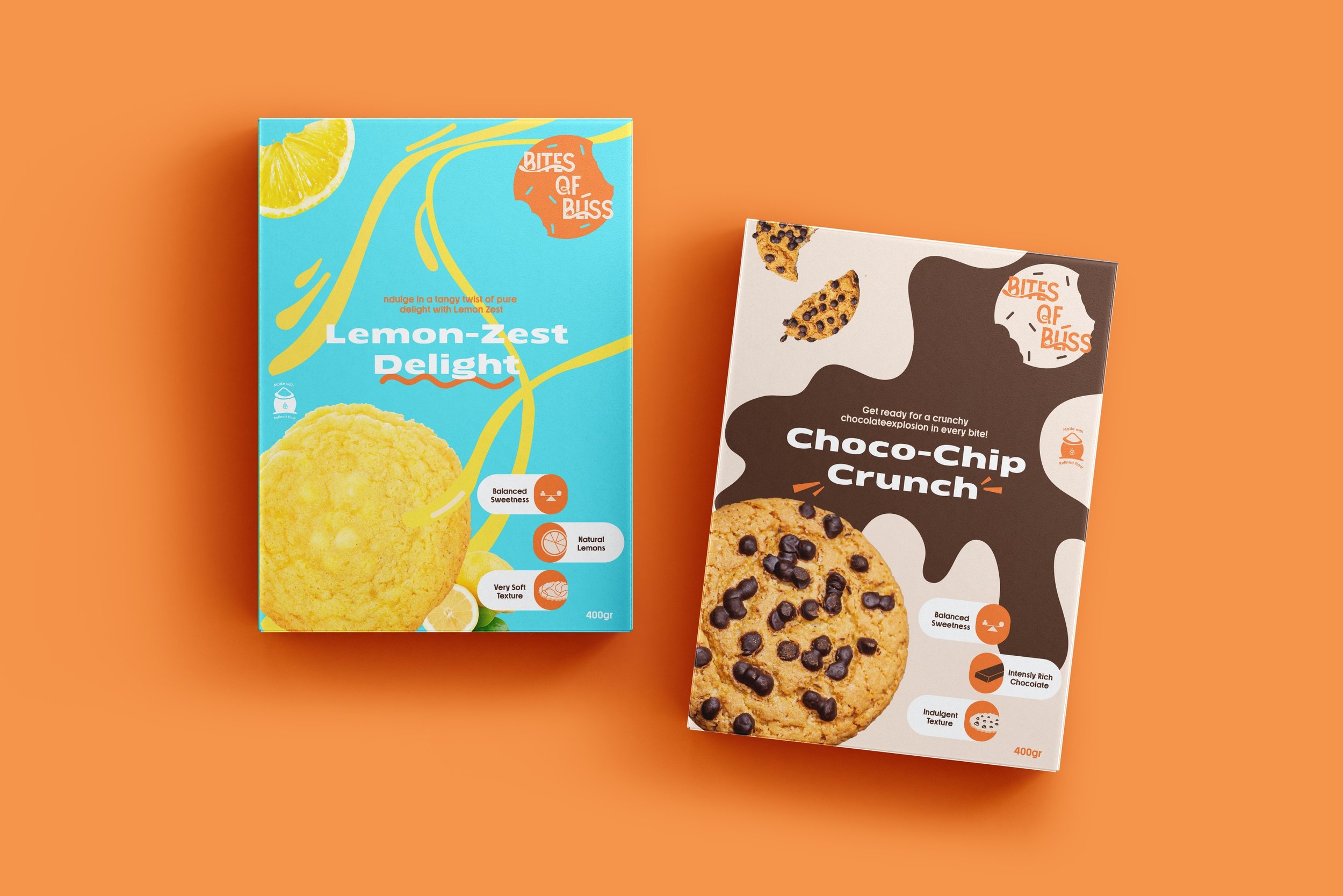
Bites of Bliss is a brand dedicated to providing customers with healthy snack options that never compromise on taste. Using only the finest and freshest ingredients, their biscuits offer a delightful combination of flavors suitable for any occasion—be it a quick snack on the go or a shared treat among friends and family.
Bites of Bliss, positioned in the bold, joyful, and tasteful category of the cookie aisle, aimed to convey excitement, taste, and playfulness through their packaging. The goal was to evoke feelings of happiness and guilt-free indulgence when customers look at Bites of Bliss products.
-
Given Bites of Bliss' emphasis on excitement, fun, and joy in every cookie bite, the logomark was designed using a playful font, customized to reflect the creamy, gooey, and tasteful essence of each cookie. A comprehensive logo system was developed for brand recognition across various packaging sizes and screen spaces. Bold and attention-grabbing sans-serif typography maintained consistency with the brand's outgoing personality. Extensive research on popular cookie brands and color psychology highlighted the need for vibrant, contrasting colors to grab attention.
The packaging for each flavor was meticulously crafted to convey the unique energy and vibe of each flavour. Indulgent chocolate packaging exuded excess and delicacy, while the lemon packaging embodied zesty freshness with a striking blue and orange color palette. This vibrant contrast of blue & yellow catches the eye and primes the taste buds for the exciting burst of lemon freshness.
Drawing on personal experiences of indulging in cookies as a kid, my focus was on ensuring that the logo and packaging designs authentically conveyed Bites of Bliss' message—offering delicious treats that bring joy to people’s lives. Through a mouthwatering branding and packaging approach, Bites of Bliss invites customers to experience the pure bliss of delectable snacks.